
Creating realistic shadows can transform a flat digital illustration into a vivid, three-dimensional masterpiece. In Krita, one of the most powerful free digital painting tools available, mastering shadows is less about memorizing rules and more about understanding light, depth, and blending techniques. Whether you’re painting characters, landscapes, or still life compositions, realistic shadows anchor your subjects in space and dramatically improve visual impact. This step-by-step guide will walk you through essential concepts and practical techniques to help you draw convincing shadows in Krita.
TLDR: Realistic shadows in Krita start with understanding your light source and choosing appropriate brush settings. Use layers strategically, apply blending modes like Multiply, and vary shadow edges to match lighting conditions. Add depth through color variation, reflected light, and subtle texture. Consistent practice and observation are key to mastering believable shadows.
Understanding Light Before Drawing Shadows
Before you draw a single shadow, you need to understand one critical principle: shadows are defined by light. Every shadow exists because light is being blocked. That means you must decide:
- Where is the light source?
- How intense is it?
- What color is it?
- Is it soft or harsh?
In Krita, it helps to sketch a small arrow on a separate guide layer indicating the direction of the light. This keeps you consistent throughout the entire drawing process.
There are two primary types of shadows you’ll work with:
- Form shadows – Appear on the object itself as it turns away from the light.
- Cast shadows – Thrown onto another surface when an object blocks light.
Step 1: Set Up Your Layers Correctly
Layer management is essential in Krita. Instead of painting shadows directly onto your base colors, follow this method:
- Create your Base Color Layer.
- Add a new layer above it.
- Right-click and set it to Clipping Group (so shadows stay within the shape).
- Change the blending mode of the shadow layer to Multiply.
The Multiply blending mode darkens the colors underneath naturally, making shadows appear more realistic than using plain black.
Pro Tip: Avoid pure black for shadows. Real shadows contain subtle color shifts, often cooler or warmer depending on the environment.
Step 2: Choose the Right Brush Settings
Krita offers powerful brush customization. For realistic shadows, modify these settings:
- Opacity: 40–70% for gradual buildup.
- Flow: Lower flow gives smoother transitions.
- Soft round brush: Ideal for soft lighting.
- Textured brush: Great for natural surfaces like skin or fabric.
Navigate to the Brush Editor (F5) if you want to fine-tune pressure sensitivity. Connecting opacity to pen pressure gives you far more control over subtle transitions.
Step 3: Block In the Main Shadow Areas
Start by identifying where light cannot reach. Paint large shadow shapes first rather than focusing on small details. Think in big forms.
For example, when shading a face:
- Under the eyebrows
- Side of the nose opposite the light
- Under the chin
- Below the lower lip
Keep edges relatively clean at first. You can refine them later.
Important: Keep your strokes consistent with the form of the object. Shadows should wrap around surfaces, not sit flat on top of them.
Step 4: Refine Edges for Realism
One of the biggest mistakes beginners make is keeping all shadow edges equally soft or equally sharp. In reality, shadow edges vary depending on distance from the object and light intensity.
- Hard edges = strong, direct light (like sunlight).
- Soft edges = diffused light (cloudy day, indoor lighting).
In Krita, use:
- The Eraser with low opacity to soften edges.
- The Blur brush selectively (avoid over-blurring).
- A layer mask for non-destructive blending.
Tip: Shadow intensity usually fades as it moves away from the object casting it.
Step 5: Add Color Variation to Shadows
Realistic shadows are rarely just darker versions of the base color. They shift in hue.
Here’s how to approach it:
- Warm light → cooler shadows.
- Cool light → warmer shadows.
- Outdoor scenes → slight blue or purple tone in shadows.
- Indoor warm light → subtle reddish or brown tones.
Instead of choosing black, move slightly toward blue, purple, or complementary tones in the color wheel.
This small adjustment dramatically increases realism.
Step 6: Paint Cast Shadows Properly
Cast shadows follow perspective rules. They are not random blobs.
To draw convincing cast shadows:
- Determine the light’s direction.
- Visualize a line from the light source past the object.
- Project the object’s silhouette onto the surface.
- Distort the shape according to surface perspective.
Cast shadows often appear darkest closest to the object and soften as they extend outward.
Step 7: Include Reflected Light
This is where realism truly comes alive.
Reflected light occurs when light bounces off nearby surfaces and softly illuminates the shadow side of an object. It prevents shadows from looking flat or muddy.
To add reflected light in Krita:
- Create a new layer above your shadow layer.
- Set blending mode to Overlay or Soft Light.
- Use a low-opacity brush with a slightly lighter tone.
Apply it gently along the edge of the shadow side facing nearby surfaces.
Important: Reflected light should never be brighter than the main lit area.
Step 8: Use Ambient Occlusion for Depth
Ambient occlusion is the darkest, tightest shadow where two surfaces meet and light has almost no access.
Examples:
- Where hair overlaps the forehead
- Between fingers
- Where objects touch a table
Use a small, slightly darker brush on Multiply mode and apply it subtly. This adds dramatic depth instantly.
Common Mistakes to Avoid
- Using pure black shadows – makes art look dull and muddy.
- Ignoring light direction – causes visual confusion.
- Over-blending everything – reduces structure.
- Same opacity everywhere – flattens the image.
- Forgetting reflected light – removes realism.
Advanced Tips for Professional-Looking Shadows
If you’re ready to elevate your shadow work further, try these techniques:
1. Gradient Maps for Cohesion
After completing your shadows, apply a subtle Gradient Map adjustment layer to unify colors. This creates atmospheric harmony.
2. Use Color Dodge Carefully
Adding subtle highlights with Color Dodge can increase contrast against shadows, making them feel deeper.
3. Study Real Photography
Open a reference photo in Krita and sample shadow colors with the eyedropper. You’ll notice surprising color shifts.
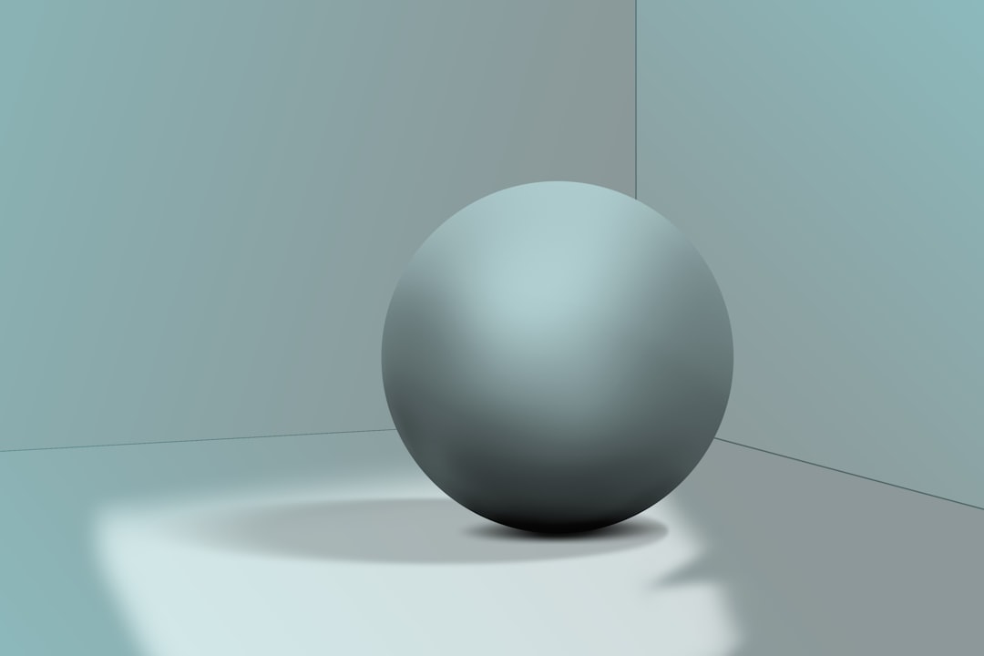
Practice Exercise: Shading a Simple Sphere
To master shadows, practice on basic forms first:
- Draw a simple circle.
- Choose a single light direction.
- Add a form shadow gradually.
- Paint a cast shadow on the ground.
- Add reflected light.
- Deepen ambient occlusion where the sphere touches the surface.
If it looks three-dimensional, you’re on the right track.
Why Shadows Matter So Much
Shadows communicate:
- Time of day
- Material texture
- Weight
- Mood
- Spatial depth
A character with poorly placed shadows looks like a sticker. A character with realistic shadows feels alive in space.
Final Thoughts
Learning how to draw realistic shadows in Krita is a blend of observation, technical setup, and artistic sensitivity. Start with a clear light source, use proper layer modes like Multiply, avoid pure black, and pay attention to edge variation. Introduce color shifts, reflected light, and ambient occlusion to achieve true depth.
Shadows are not just darker shapes—they are storytelling tools. With practice, patience, and careful attention to how light behaves in the real world, you’ll see your digital paintings transform from flat illustrations into immersive, dimensional works of art.
Keep experimenting, keep observing, and most importantly—keep painting.