
Converting raw data into understandable information is very challenging and time-consuming. Theoretical data and long numbers might be exhausting.
However, you can present data in many different ways besides long texts. Other visual contents can explain those texts, thus having a more substantial impact on readers’ understanding and comprehending that data.
Adding videos, reports, or charts to the existing text makes readers stay focused and interested in the subject. There are many visualization tools developed to make this process easier.
This article will mention some of the best chart-making tools that let you easily create charts containing your data and strongly relate the charts to your business identity.
So let’s start!
Visme
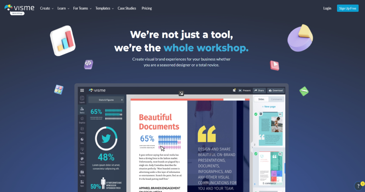
Visme is a tool used by over 10 million people. It guarantees interactive magic out of raw data. One of its most popular tools is the chart tool.
Furthermore, Visme lets users decide how to present data in the charts. They have a free library of chart templates to visualize essential data better.
After uploading data, a user can change the preselected template and choose among templates and chart types to find the best choice to present data in the best way possible.
Also, a user can add other media, icons, illustrations, or brand fonts and colors to make a unique chart and branded company content.
For beginners, they have a simple dashboard and drag-and-drop tool that lets a user select the best options for them. On top of that, created charts are always available for sharing, reusing, or downloading.
They can easily be imported into other projects or integrated with other apps. Visme comes in a free version and more paid packages with additional features.
Canva
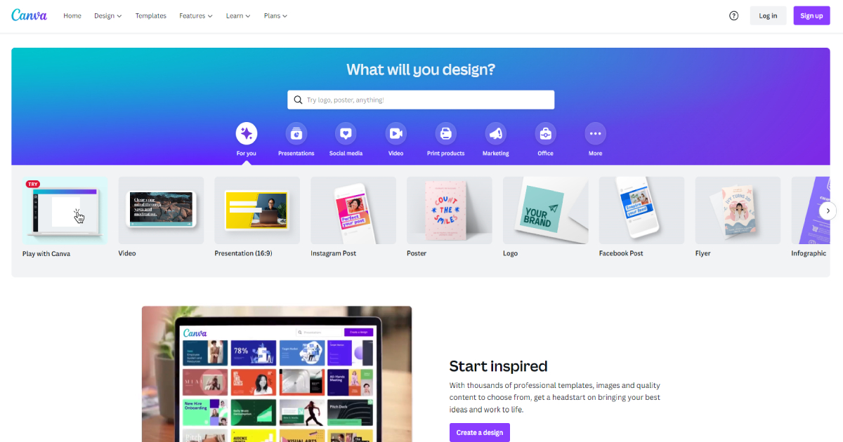
Canva is one of the most popular and widely used design platforms. Due to its simplicity and various functionality, Canva is an excellent choice for beginners and professionals alike.
It offers numerous specialized templates for making very professional designs for different categories: social media, business, education, marketing, publishing, etc.
Besides creating presentations, videos, or other professional posters, Canva offers excellent templates for detailed reports and charts.
These predetermined templates let users create professional charts yet make them unique over a simple dashboard and custom tools.
It offers simple data input and automatically shows changes on charts. The fast edit and data visualization keeps users’ working momentum and productivity, saving valuable time.
Furthermore, you can easily embed charts into other Canva presentations over a drag and drop feature. Also, a user can download it, print it, or share it anytime.
Canva comes in free and pro versions for smaller teams and an enterprise version for large companies.
Creately
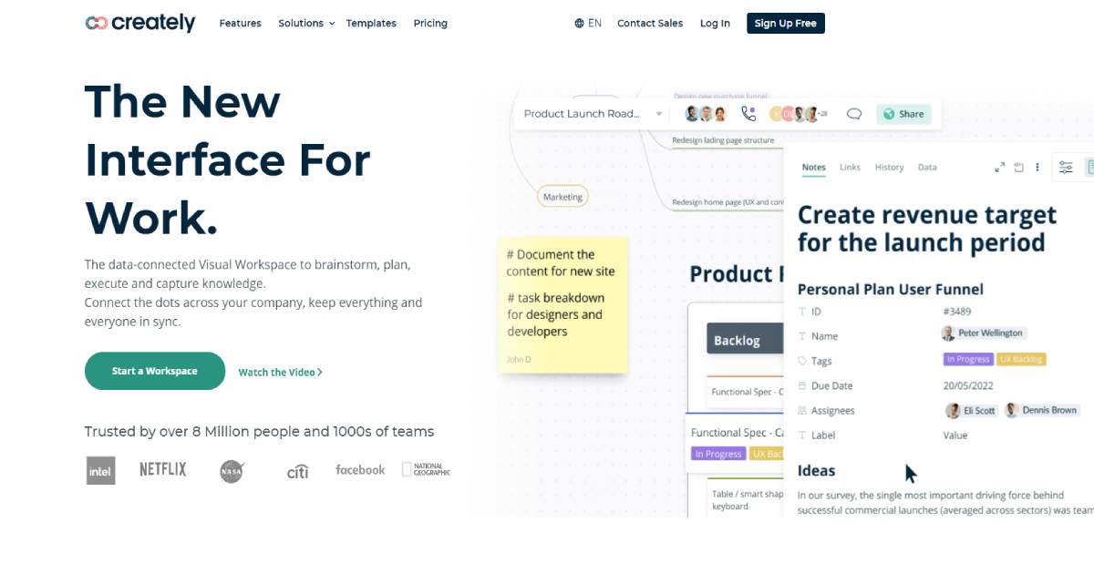
Creately is a trendy visualization tool already recognized by more than 4 million users. As the name suggests, Creately is a powerful tool that lets you create any data presentation document or report.
It offers various charts and visuals for various business and business segments. It has an extensive free library of different predefined themes, shapes, styles that users can use or customize.
Its visual workspace editor lets users input data, draw and apply and customize any predefined element.
Then, data can be connected and linked to other content, notes, or documents. This editor works fast, and any change is always synced and shown in real-time.
This tool is great for team collaboration. It has a mighty task workflow management tool: team members can always see current projects and who should do future changes, leave comments, share and export charts and documents, and use other app integrations.
Creately is available for free users with limited access. Other pricing packages have more features well-tailored for teams or companies.
Venngage
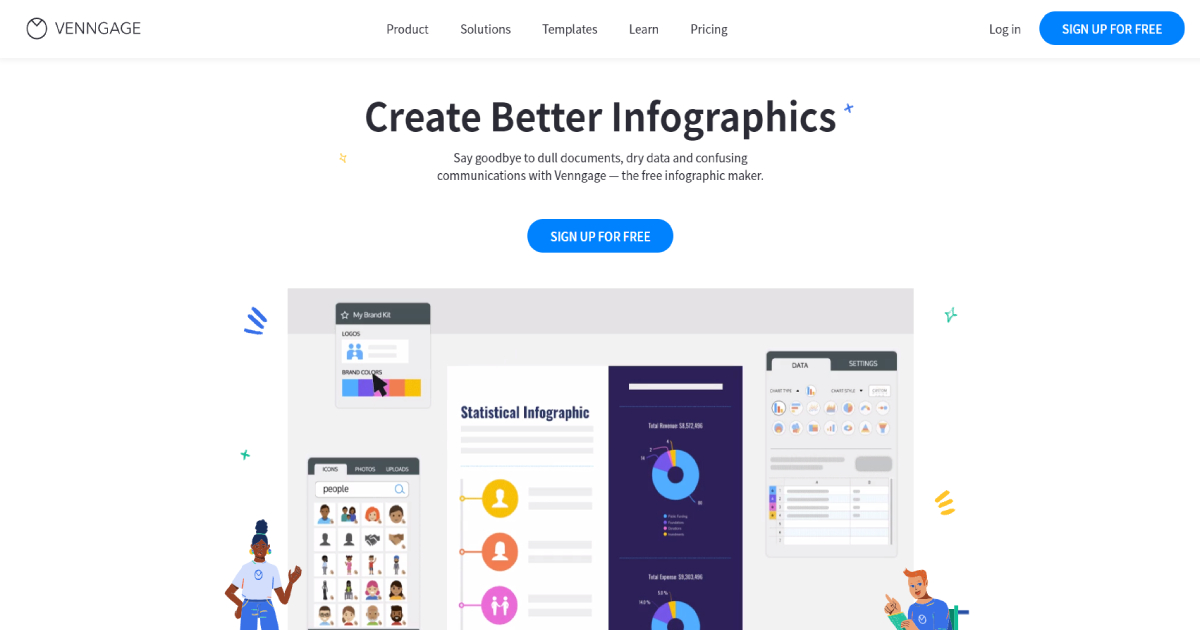
Venngage is a data visualization tool for creating professional and understandable infographics out of boring data. Hence, it offers over 20 features and tools, where chart tool is one of the most used.
Venngage has a library with more than 7 thousand professionally designed templates for many industries and different types of specialized needs.
Among others, it contains hundreds of various charts and icons. It lets users convert their raw data into robust visualizations over its simple editor and many features.
Users can select templates, customize them, add different icons, pictograms, or illustrations to get the best charts for their presentations.
Also, users can make charts on their own from scratch or make them unique by adding images or brand colors. You can easily embed these charts into any other visualization and presentation document enriched with text or other media.
Moreover, every Venngage document is sharable among team members and easily accessed to collaborate. Venngage’s free version has useful yet limited features.
Depending on the business or industry, they have many other pricing packages that offer numerous advanced tools and possibilities.
Conclusion
Overall, data visualization is essential for presenting and improving the business. Putting it in charts can make it more understandable and easier to process. That is why data chart tools are helpful.
Hence, this list shows some of the best chart tools available. They offer many templates and easy approaches to customizing them and applying your data to them.
Before choosing one, you should try them all to see which feels best and suits your needs.