
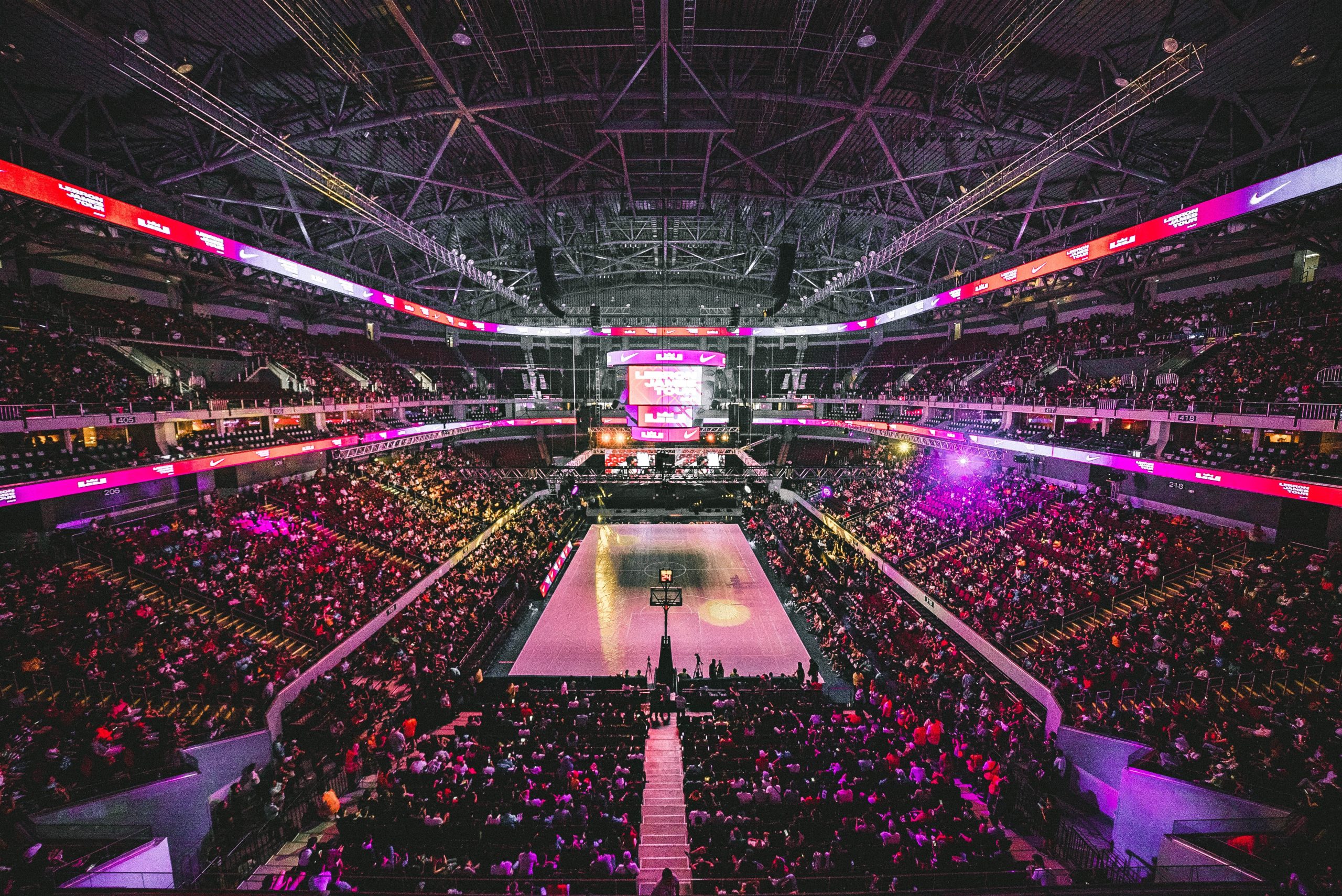
If you’re passionate about basketball and branding, using an NBA logo maker can be the perfect way to craft a personalized logo that captures the energy and excitement of the game. Whether you’re creating a logo for a fan club, amateur league, fantasy team, or just for fun, approaching the design process like a pro will ensure your final result stands out. A strong basketball logo not only reflects team spirit but also tells a story with color, shape, and symbolism.
TLDR (Too Long, Didn’t Read)
Designing with an NBA logo maker isn’t just about flashy designs—it’s about using a thoughtful approach that blends creativity, simplicity, and sports culture. Master the logo-making process by learning key principles like color theory, typography, and icon design. Whether you’re representing a team or your personal brand, a professional look can be achieved with the right tools and a little strategy. This guide walks you through the keys to designing like a pro.
Start with a Vision: What Does Your Team Represent?
Every great design begins with a clear vision. Before you even launch the logo maker, ask yourself a few essential questions:
- What is the identity of your team or brand? (Strength, skill, city pride?)
- What emotions do you want the logo to evoke? (Aggression, unity, excitement?)
- What colors best represent your vision?
Pro designers always start with purpose, ensuring every design choice has meaning. Jot these ideas down before entering the logo-maker platform.
Choose the Right NBA Logo Maker
With countless logo generators available, finding one that fits your goals is critical. Look for an NBA logo maker that offers:
- Custom shape templates inspired by professional team logos
- High-quality vector graphics for scaling and printing
- Sports-themed icons and fonts tailored to basketball aesthetics
- Ease of use with intuitive drag-and-drop features
Popular tools like Placeit, BrandCrowd, and Looka offer these features, but don’t hesitate to explore niche platforms or even Adobe platforms if you’re more advanced.
Master the Color Game Like a Pro
NBA logos are known for bold, memorable color palettes. Think red and black for intensity, blue and white for professionalism, gold for prestige. Here’s how to use color like a branding expert:
- Pick no more than three primary colors. Too many can confuse the design.
- Use contrast wisely. It helps your logo pop across different backgrounds.
- Be strategic with meaning. For example, red symbolizes strength and passion.
Use online tools like Adobe Color or Coolors.co to test and generate color schemes that complement each other while conveying your team’s message.
Iconography: The Power of Symbols
Icons are the visual heartbeat of any logo. NBA team logos often feature animals, basketballs, stars, and other symbolic representations of their team names or cities. When choosing your graphic symbol, keep these pro tips in mind:
- Keep it simple and recognizable. You want instant recognition even at small sizes.
- Use symbols that echo team values. A panther could signify agility and speed; a shield could imply defense and strategy.
- Don’t overcrowd. One or two well-drawn icons are more effective than a clutter of visuals.
Most NBA logo makers come with a library of sports or basketball icons. You can also import your own SVG files for more personalized touches.
Text Treatment: Name, Fonts, and Taglines
Choosing the right font is a major step in designing like a pro. The NBA logo and its teams often use bold, all-caps fonts to convey authority, speed, and athleticism. To stand out while staying relevant:
- Pick bold, geometric fonts for strength.
- Use script or custom fonts for creativity and flair.
- Limit text to key elements: team name, city, tagline (if space allows).
Consider professional fonts such as Varsity, Agency FB, or Big Noodle Titling. Always ensure that your font complements your icons and colors rather than competing with them.
Layout and Alignment: Keen Eye for Balance
When it comes to logo composition, layout matters. A design can have amazing elements but still fall short if improperly aligned. Keep these principles in mind:
- Symmetry adds professionalism. Most NBA logos have balanced proportions for a clean look.
- Hierarchy matters. Prioritize team name, then graphics, then secondary details.
- Test vertical vs. horizontal layouts. See how your logo performs in both orientations for web and merch placement.
Step away from the screen occasionally to examine your design from a distance. A fresh perspective can reveal imbalance and awkwardness that isn’t obvious up close.
Test on Real-World Applications
Once your design feels complete, imagine it in the wild. Would it look great on a jersey? Can it serve as a social media avatar or a YouTube banner? Pro designers test their logos on multiple formats before finalizing.
NBA logo makers like Placeit include mockup tools to view your design on gear, hats, and merchandise. Export your design in high-resolution PNG or SVG formats, and preview it in multiple sizes for clarity and visual impact.
Don’t Be Afraid to Iterate
Even legendary brand logos have gone through dozens of revisions. A single session might produce something decent—but real polish takes time. Save different variations of your logo, test them with friends or teammates, and revisit them with fresh eyes.
Iteration is the secret weapon of professional designers. Don’t rush the process. Greatness takes refinement.
Learn from NBA Teams and Their Logos
Finally, there’s no better teacher than the existing logos of real NBA franchises. Study how teams like the Chicago Bulls, Miami Heat, and Golden State Warriors use shape, symmetry, and symbolism. Analyze what makes their logos memorable and emulate those techniques without copying outright.
You can even compare historical revisions of team logos to understand what evolved and why certain elements stayed the same.
Final Thoughts: Playing the Long Game
Using an NBA logo maker allows anyone to jump into the world of visual branding. But standing out requires more than gimmicks—it requires thought, vision, and the ability to communicate visually. By sticking to principles of color, typography, symbolism, and structure, you’re well on your way to designing a logo that feels professional and powerful.
And remember: in basketball and in branding, consistency wins championships.