Are you looking for a way to open the mobile version of a website on your desktop computer? This guide will show you how to view a mobile website on a desktop using the browser agent trick.
Did you know that you could access the mobile versions of your favorite websites using your desktop browser? Whether you’re curious to see the mobile versions or test mobile websites, accessing them using your desktop browser is straightforward.
Most websites provide different user interfaces for tablets, smartphones, and other mobile devices.
So, let’s see how to open mobile versions of websites using your desktop browser.
Viewing the Mobile Website on Desktop
What we have to do is change the browser’s user agent. User agent tells a website about the browser, OS, and device you are using to access that website.
By changing the user agent, we are tricking the website into believing that we are using a different browser, OS, and device than what we’re using. This change makes the website serve us the version that suits our fake identity.
Now, wondering how to change the browser’s user agent? You can do this manually or install a browser extension to make it easier. We’ll go by the browser extension route here.
User-Agent Switcher Extensions for Desktop Browsers
It is better to install a browser extension because it’s less technical and helps you change the user agent in one click. On top of that, it is indeed easy to use.
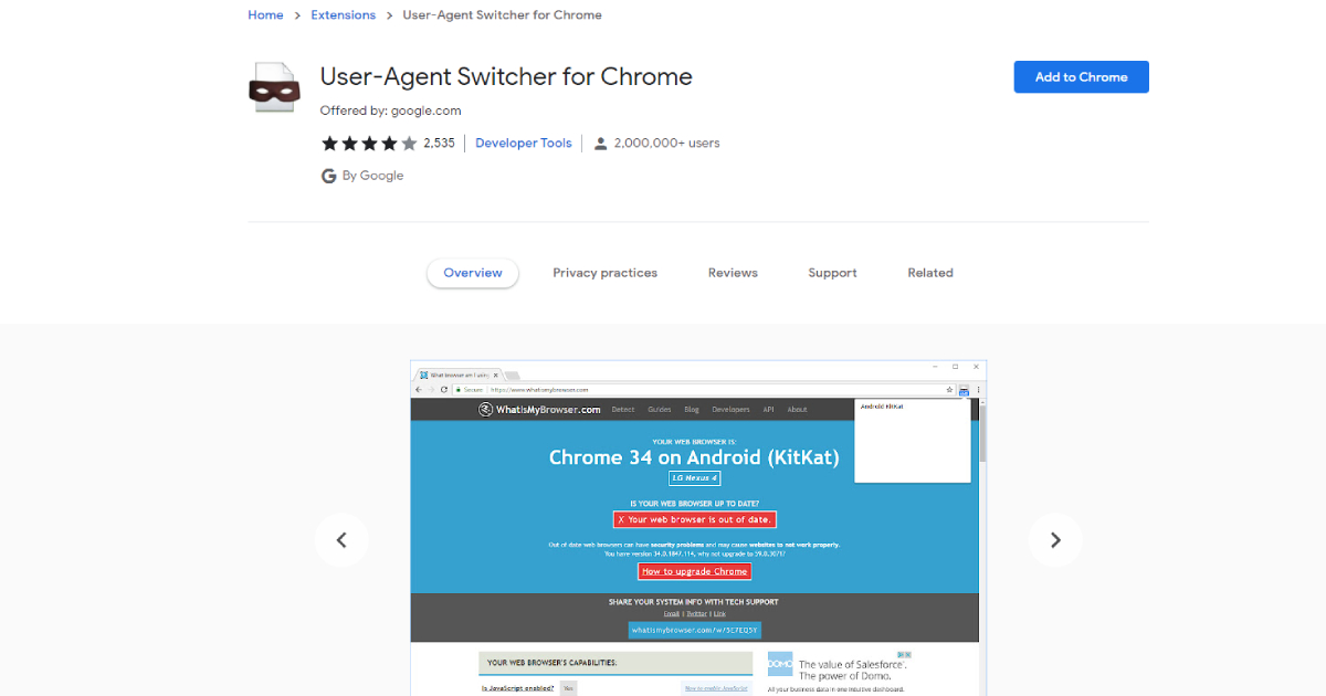
If you are using Google Chrome, follow the link to get User-Agent Switcher for Chrome or if you are a Mozilla Firefox user, get this User-Agent Switcher for Firefox.
Install and activate the User-Agent Switcher extension and restart your browser.
How to Set a Mobile User-Agent
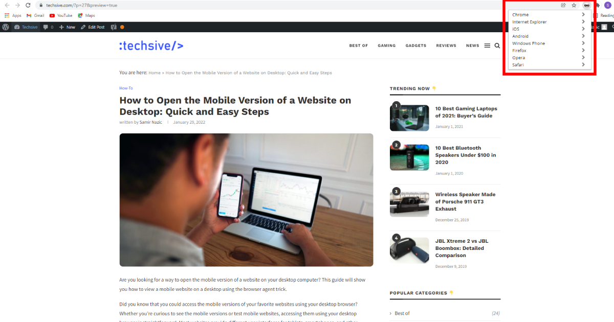
To change your browser’s user agent, click on the User-Agent Switcher extension’s icon, which you can find on the browser’s toolbar.

You can then select a mobile user-agent from the list that it displays.

That’s it, and you can now visit any website to access its mobile version from your desktop browser.
From now on, every website you visit will serve you its mobile version as long as you have your user agent set to mobile. When you want to go back to seeing desktop versions of sites, click on the User-Agent Switcher icon again and select “Default” user agent.

The method is almost similar in most User-Agent Switching extensions, and it’s effortless, as you know by now.
Using Firefox, you may have to manually drag and drop the user agent switcher’s icon to the toolbar. Drag and drop the User-Agent Switcher’s icon where you like it to be.
To do this, click on the menu icon on the toolbar and select customize.
How to Get More User Agents to View a Mobile Website on Desktop
Not all User-Agent Switcher extensions come with an extensive list of user agents. But worry not; you can always download more user agents right from the options provided by the User-Agent Switcher extension. You can also manually enter a user-agent string in your User-Agent Switcher. A quick google search will get you the user-agent strings for any device you want.
If you want to know what a user-agent string looks like, here is the user agent for a Nexus 7 with android 4.3 and chrome browser:
Mozilla/5.0 (Linux; Android 4.3; Nexus 7 Build/JWR66Y) AppleWebKit/537.36 (KHTML, like Gecko) Chrome/29.0.1547.72 Safari/537.36
Conclusion
Mobile versions of websites tend to load more quickly than their desktop versions. Changing the user agent can come in very handy, especially if you are a web designer who wants to test mobile versions of websites without leaving your desktop screen.
It can also be helpful if you’re going to browse faster on a dead-slow internet connection. Now that you know how to view a mobile website on a desktop using browser agent switching, it’s time to go ahead and put it to test.

